Interpreting the monochrome: how Li Yuan-chia, Piero Manzoni and Robert Ryman ascribe meaning to their white monochrome surfaces
by Maia Tacey • November 2023 • Journal article
Introduction
White monochrome paintings could be regarded as an extreme example of abstract art’s ability to confound. They often seem to defy interpretation, and the search for recognisable iconographic, stylistic or historic signifiers that could help to develop an idea of their meaning can be difficult without a firm grounding in the theories of abstraction. For some, the white monochrome painting has come ‘to symbolise everything that is believed to be elitist and difficult about modern and contemporary art’.1 However, much of their meaning lies on the very surface. Through an analysis of three such paintings, dating from between 1958 and 1982, by Li Yuan-chia (1929–94), Piero Manzoni (1933–63) and Robert Ryman (1930–2019), this article explores some of the ways in which meaning can be inferred from an artist’s choice of materials and methods of application. Its interpretative framework is based on a material–technical investigation combined with historical and theoretical analyses, with an additional focus on the artist’s intentions, in order to demonstrate the myriad analytical opportunities in such works. By reorientating the focus from a search for imagery to an investigation based on paintings as ‘permanently fused layers of many different materials’, new forms of meaning-making become clear and help to demystify the imposing edifice that is the white monochrome abstract painting.2
The three paintings that form the basis for this article, Monochrome White Painting by Li (1963), Achrome by Manzoni (1958) and Ledger by Ryman (1982), are all in the permanent collection of Tate.3 They have been chosen as examples of white monochrome paintings in which material and technical analyses can complement a historical–theoretical interpretation. These technical investigations were carried out in February 2023 at Tate Modern, London, through a combination of close physical inspection and research into the specific materials, their components and the methods of application used by the three artists. Each demonstrates a different technique with which white monochromatic painting can be imbued with meaning, evidencing Olafur Eliasson’s argument that ‘the monochromatic space holds plurality in it – it welcomes multidimensionality and offers it to us as viewers’.4
As the curator Adrienne Edwards has argued, monochrome paintings necessitate ‘complex thinking and sensorial engagement on the part of the viewer’.5 This can require some patience on the viewer’s part as society’s increasing dependence on technology contributes to our inexorable ‘withdrawing from presence, from direct intimacy and touch with the material world’.6 However, focusing on the surface matter of a monochrome work arguably provides the viewer with an opportunity to explore, as proposed by the artist Simon Morley, ‘an embodied consciousness in which the mind and body are immersed with the rest of reality’.7 Morley proposes that one effective way of engaging with monochrome painting is to consider its haptic qualities, emphasising the role of the body and creating a ‘heightened awareness of painting as a substantive and a textured surface rather than a fixed, visually apprehended form’.8
The key component of the analytical framework employed in this article is a focus on the physicality of the work and the technical processes used in its creation, primarily through the lens of technical art history – a term coined by David Bomford in the 1990s to refer to ‘the combined study of art history and conservation science’.9 For the purposes of this article the ability of technical art history to highlight ‘the status of painting as matter’ is crucial.10 Aside from its applicability to conservation, technical art history as an analytical framework is made necessary, as Ad Stijnman argued, by the fact that ‘without an understanding of artists’ processes, the findings of art historians will inevitably be compromised’.11 This is especially true in the case of white monochrome paintings, where there is little or no narrative thread.12
As well as drawing attention to the material characteristics of works of art, technical art history foregrounds the aims of the artist. For conservators, the ‘preservation of the intentions of the artist’ is of paramount importance and, although it can cause points of contention, there is a strong case for adopting this approach to art-historical studies generally.13 As Stijnman suggests, it is useful to think ‘from the perspective of the maker of art’, taking into account the legible objectives behind each decision.14 However, it is necessary to acknowledge these debates, especially within the context of conservation as the emergence of two distinct groups brings an interesting dichotomy to light: the practices of intentionalism and anti-intentionalism.15 As the conservator Steven W. Dykstra argued, the ongoing discussion about intentionality within the realm of conservation results largely from ‘differences of perspective on the relative roles of science and art history in the interpretation of artist’s intent’ as well as the ‘ambiguity of the term intent’ itself.16 For the purposes of this article, Michael Baxandall’s conception of artistic intentionality as a ‘relation between the object and its circumstances’ rather than a ‘reconstituted historical state of mind’ has been adopted.17
Material history – examining the usage of materials and investigating the sociocultural meanings embedded in them – is another important component of this investigative framework. Delving into the history of the materials used in white monochrome paintings can be instructive, both in terms of interpretation and understanding how transformations visible on the surface of the paintings would have occurred. However, it must be noted that the significance of materials in relation to a work of art’s identity is anything but straightforward.18 In her article ‘Material significance in contemporary art’, Rebecca Gordon utilised the phrases ‘material structure’ and ‘material as signifier’ to stress the distinction between ‘materials intended to be an end in themselves’ and materials ‘chosen for their associative values’.19 Considering how some twentieth-century artists approached monochromatic paintings from this perspective can help expand the role of material analysis to include a fuller consideration of material history.
The modern monochrome
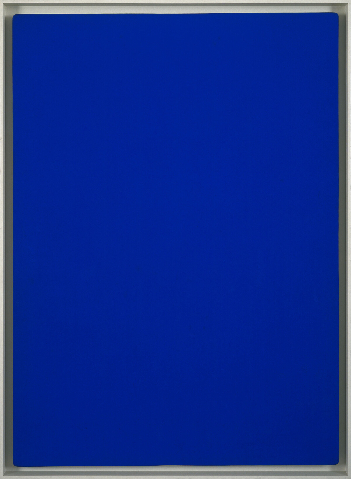
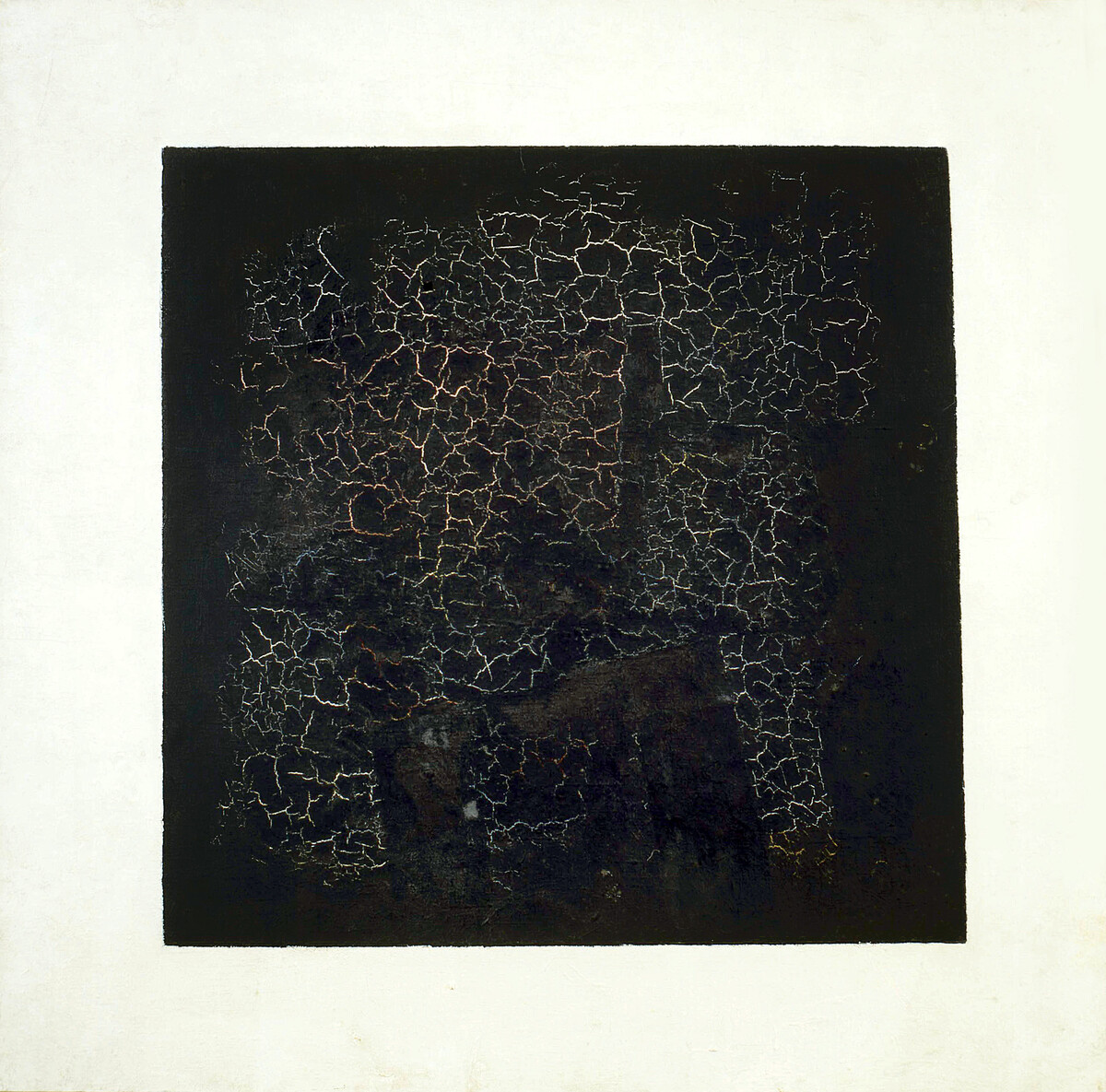
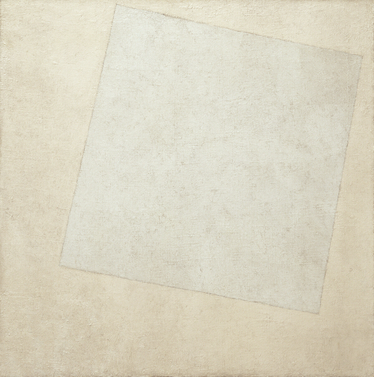
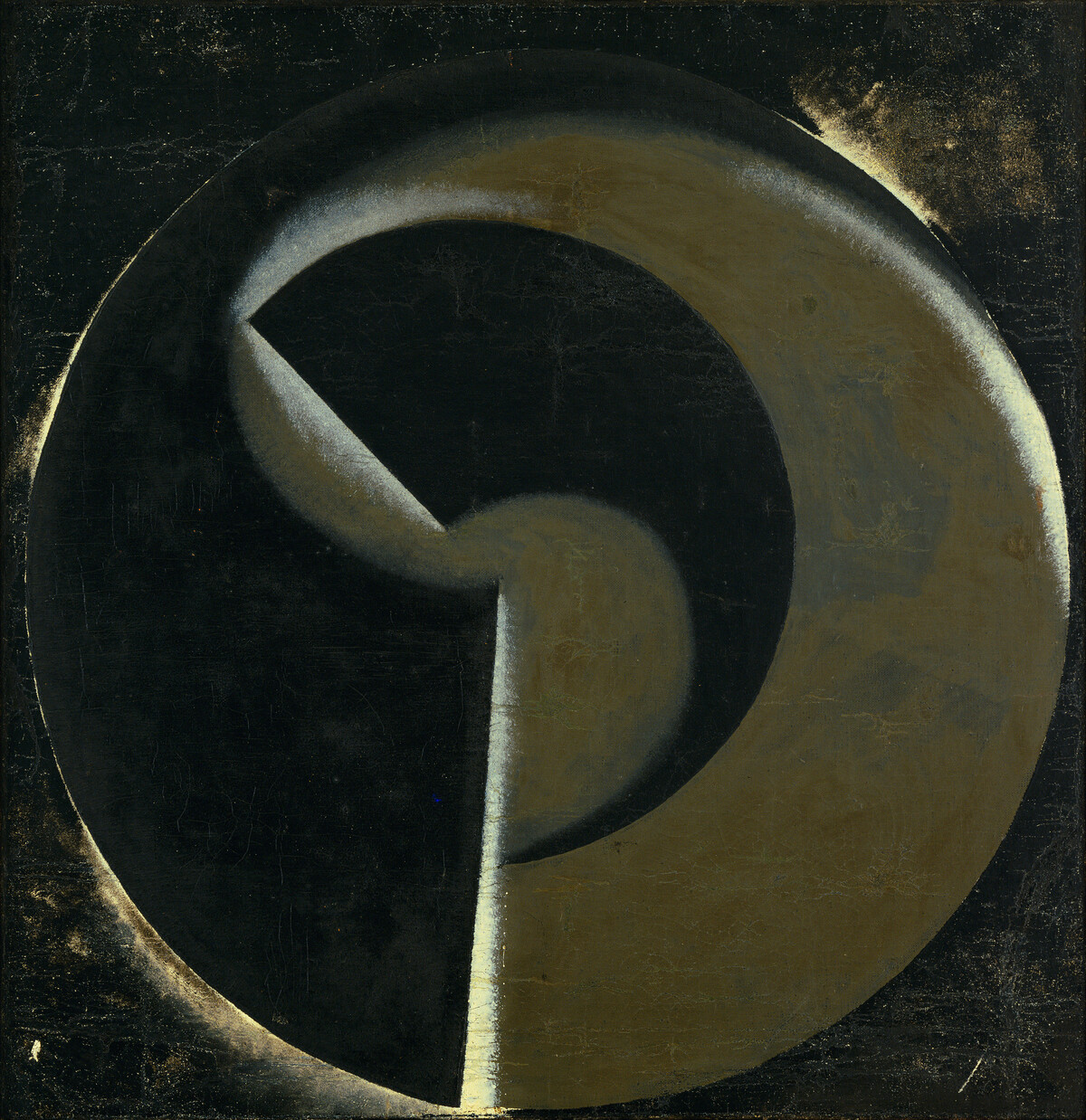
The inception of the monochrome in modern art is often associated with Suprematism, in particular with the work of Kazimir Malevich (1879–1935).20 Black Square FIG. 1 and Suprematist Composition: White on White FIG. 2 were considered radical in reducing painting to its ‘pure physical elements’.21 The latter brought to the fore the idea of faktura through the artist’s manipulation of the medium to mimic a sense of depth.22 Reflecting ‘the energy or reticence of the brushstroke, the solidity or liquidity of pigment, the opacity or transparency of the surface’, faktura is a useful tool for considering abstract methods of painting from a technical–material approach.23 Aleksandr Rodchenko (1891–1956) determined ‘the essence of painting to be its technique’.24 Although he produced monochrome paintings in a variety of colours, his ‘black on black paintings’ from 1918 – for example Non-Objective Painting no.80 (Black on Black) FIG. 3 – best express his experimentation with reduction.25 Yves Klein (1928–62) took a different approach. Blue Monochrome FIG. 4 is one of a series in which he used total abstraction to communicate ‘the integration of body and spirit in the service of more than the self’.26 Over the course of the twentieth century, a plethora of artists experimented with monochrome painting, including Lucio Fontana (1899–1968), who experimented with puncturing and slashing his canvases; Ad Reinhardt (1913–67), who experimented with extracting oil from pigments; and Ellsworth Kelly (1923–2015), who used a monochrome palette to emphasise the flatness of the surface.

In South America in the 1950s and 1960s, artists associated with the Neo-Concrete movement also turned to monochrome.27 Artists working in Brazil used it not as a tool for spiritual communication or as a display of reduction, but as a ‘liberating tabula rasa’, using total abstraction to open up space for new forms of artmaking.28 For example, Hélio Oiticica (1937–80) made monochrome works on wood, which he painted on both sides and suspended from the ceiling, bringing ‘liberated colour’ into three-dimensional space.29 Oiticica – like Li, Manzoni and Ryman – also experimented with a white monochrome palette in one of two-dimensional paintings, Bilateral ‘Teman’ BIL 003 FIG. 5. In Japan, the Gutai Art Association, formed in 1954, also began to explore the possibilities of the monochrome.30 For Gutai artists, the intention was to explore ‘the freedom of the instincts as a more valuable source of ultimate meaning than intellectual reflection’, using the monochrome as a form of liberation much like the Neo-Concrete artists in Brazil.31
Li Yuan-chia: ‘Monochrome White Painting’ (1963)
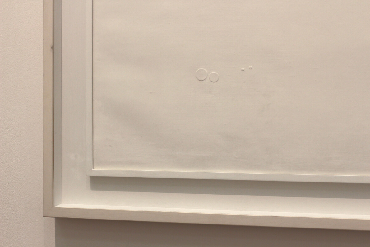
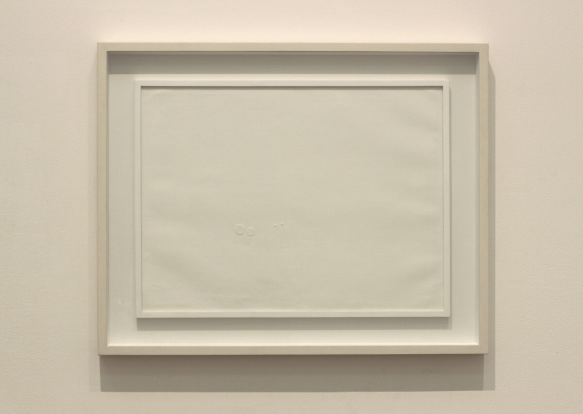
Li’s Monochrome White Painting FIG. 6 exemplifies a form of monochrome painting that can be interpreted according to a historical–theoretical approach – in this case, in terms of cosmic imagery, colour theory and Eastern philosophy. However, a material analysis can broaden the scope for interpretation. Li was born in Guangxi, South China, in 1929 and moved to Taiwan to study art after the communist revolution of 1949. He is credited with making some of the earliest abstract paintings in Taiwan during this period.32 In 1957 Li and seven friends founded the Ton Fan Group, which is considered to be the first Chinese group to show abstract works.33 During this period Li developed his motif of the ‘point’, which directly related to his interest in cosmology and ‘could vary from an almost imperceptible graphic or calligraphic dot to a substantial circular form’.34
In 1962 several members of the group, including Li, moved to Bologna. Li was deeply influenced by his surroundings during his time there, where he joined the Il Punto group. He was also greatly impacted by the Milanese painter Antonio Calderara (1903–78). Direct comparisons can be drawn between the work of the two artists, especially in Calderara’s Senza titolo FIG. 7, which uses white monochrome to explore notions of infinity. As Guy Brett has argued, ‘Calderara’s luminous abstract paintings may well have influenced the simplicity of Li’s painting’.35 While living in Bologna, Li worked in a furniture factory under the patronage of the ‘flamboyant furniture manufacturer and art collector’ Dino Gavina.36 Gavina’s influence can also be seen in Li’s experiments with appliquéing and puncturing. After Li moved to London in 1966, his ‘cosmic points’ left the canvas, becoming instead ‘moveable’ parts of installations.
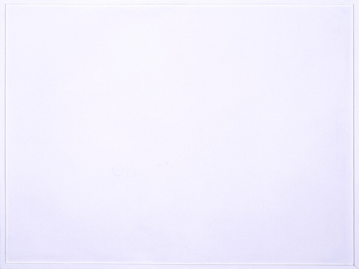
At first glance, Monochrome White Painting appears to be a plain white canvas encased in a narrow white frame. On closer inspection, however, four asymmetrical cardboard circles FIG. 8, which are painted the same shade of white as the rest of the canvas, become clear. An inscription on the reverse of the canvas records that the work was made in San Lazzaro di Savena, Bologna, suggesting that it can be linked to the work of Gavina and Calderara. Li’s interest in these models is expressed primarily through his motif of the ‘point’, which allows for a historical–theoretical analysis. However, before delving into Li’s conception of the ‘point’ it is important to note that, unlike Manzoni and Ryman, the colour white had a cultural significance for Li. The artist worked almost exclusively in white, black red and gold; for him, ‘black represented origin and end, red blood and life, gold nobility and white purity’.37 The idea of purity is directly reflected in Li’s combination of Chinese metaphysics and European abstraction, resulting in his use of the ‘point’ to communicate ‘the origin and end of creation’.38 The use of white not only conveys purity, but also draws attention to the form and positioning of the physical ‘point’ on the canvas. The placement of the ‘point’ is revealing in terms of Li’s intention. As Paul Overy has argued, for Li ‘the point was a concentration of energy’ and much of this was communicated by ‘its position on the plane or surface’.39 The compositional placement of the ‘point’ was the vehicle through which Li expressed ‘the position of the individual in the infinite space of the universe’, which arguably is the painting’s central objective.40
Rather than leaving the canvas unframed Li chose a white frame FIG. 9 to enhance the notion of purity. From an ontological perspective, this aligns with a traditional East Asian framework that ‘the world is not considered external to the self, but rather is internal’.41 In terms of a material analysis, Li’s choice of paint is noteworthy. Li may have used polyvinyl acetate, which is typically employed as an interior paint, because of its handling properties. As it has a low refractive index, it produces a matt surface and there is little variation in its appearance in different light conditions.42 A sense of interiority, simplicity and even purity is generated by this consistency – the pigment seems impervious to reflective distractions. The matt surface also helps to draw the viewer’s eye to the work’s small relief circles. Similarly, Bridget Riley (b.1931) has also worked with polyvinyl acetate emulsion to avoid the distraction of ‘reflections in the paint’s surface or variations in its thickness’.43
Piero Manzoni: ‘Achrome’ (1958)
Manzoni took a distinctly different technical approach to Li. Whereas Li chose his materials to convey philosophical meaning, Manzoni made his the primary focus of his art, and as a result the interpretation of his works benefits greatly from the approach of technical art history. His aim was to create art ‘without content beyond its immediate materiality’.44 Manzoni grew up in Milan but also spent much time in Albisola, and both places shaped his development as an artist.45 In Milan in 1957 Manzoni visited a number of exhibitions that proved to be formative. Among them were Klein’s Proposte Monochrome: Epoca Blue (Galleria Apollinaire) and a show of Alberto Burri’s work at Galleria del Naviglio, which would have enabled Manzoni to engage with Matterism.46 In Albisola, Manzoni came into contact with Fontana, who was ‘to make a vital contribution to his future work and was the first to notice his artistic innovations’.47 In ‘The White Manifesto’, Fontana proposed that art was in a ‘dormant phase’ and that ‘new art requires that all of man’s energies be used productively in creation and interpretation’.48 This productive creation can be seen in Manzoni’s work, particularly his Achromes series.49 Although Fontana is perhaps best known for his works on canvas, his ceramics, produced in Albisola, had a clear influence on Manzoni. Fontana’s ceramics aimed to convey ‘the beauty of chance and accident’, evidenced by such works as Cupido FIG. 10.50 This is reflected in Manzoni’s devotion to experimenting with the visual possibilities of multiple materials.
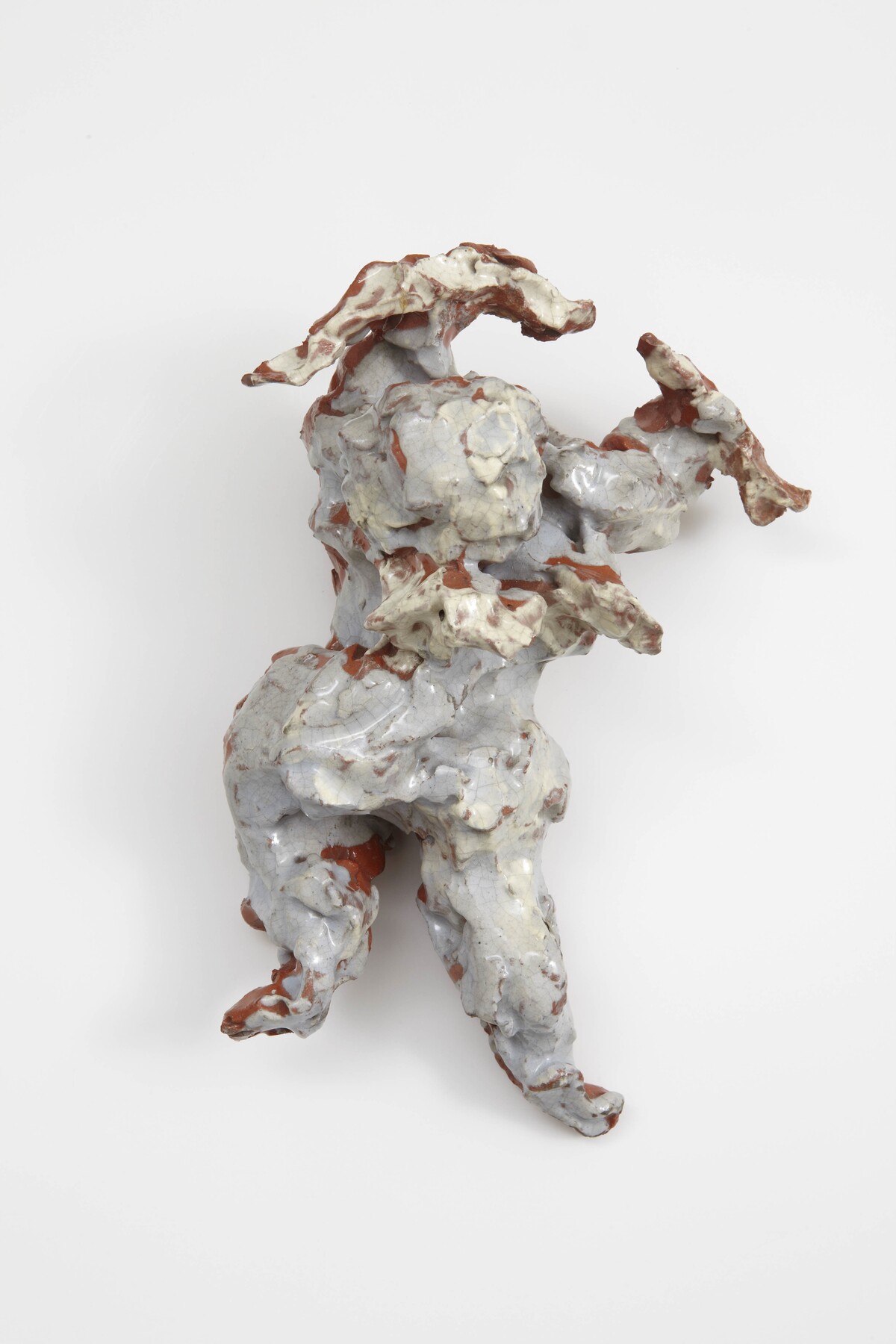
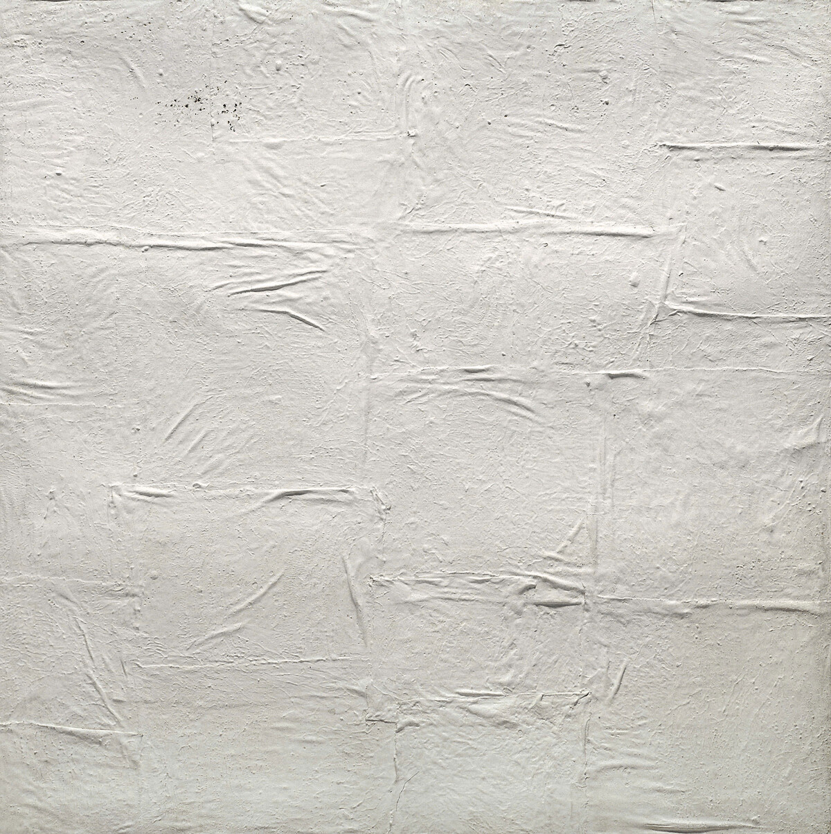
Over time, Manzoni’s Achromes developed from canvas impregnated with china clay and glue to works consisting of less orthodox materials, such as wads of cotton, straw and polystyrene, usually displayed in a white frame. Germano Celant argues that Manzoni’s Achromes were devoid of both colour and narrative function in ‘favour of a more radical purity’ to expose material transformations.51 In Achrome FIG. 11 Manzoni achieves this by using squares of canvas soaked in kaolin, which were then left to set ‘without any physical intervention from the artist’.52 The effect of soaking the canvas rather than applying the kaolin by hand is that the folds in the sagging canvas become hardened and crystallised, almost freezing the material transformation in time FIG. 12.53 Manzoni used unprimed canvas, as can be seen in a very small section of Achrome (1958). It is unclear exactly what kind of painting support Manzoni used for this work, but in Achrome (1959; Fondazione Piero Manzoni, Milan), he worked on burlap canvas stretched over a wooden strainer and then attached a cotton canvas with a series of creases onto the stretcher.54 The similarity in style and close proximity of the date of creation between the two suggest that Manzoni used burlap for the earlier Achrome as well. Burlap’s coarse texture and loose weave make it relatively impermeable, ensuring minimal interference with the kaolin’s natural drying process and providing a robust structural support for the soaked canvas. Manzoni’s insistence on this demonstrates his assertion that ‘the dignity of art need not pass through the artist’s body in order to acquire an absolute visibility’.55
Manzoni sought to produce works of an achromatic nature in an effort to escape sociocultural attributions of meaning. The artist Jon Thompson (1936–2016) argued that Manzoni used Achromatisation as a ‘conceptual tool by means of which he was able to generate different approaches to form’, rendering the work ‘without chromatic identity’.56 In fact, this reduction of chromatic identity in Manzoni’s Achromes is so fundamental that it has led to conservational challenges. One Achrome in particular, dated 1962 and composed of twelve cotton squares, has yellowed over time, undermining ‘the fundamental message Manzoni wanted to transmit’.57 However, it is also worth noting that for the Achromes it was important for Manzoni that he ‘arrested and blocked the fertilising power of his own participation’ to eradicate ‘gesture and action’, perhaps suggesting that any intervention might counteract Manzoni’s putative intentions.58 This eradication of gesture was so critical that, in one of only two issues of a magazine he created with Enrico Castellani, Manzoni dedicated an editorial to underlining his ‘completely new artistic conception totally opposed to art as representation and expression’.59 For Manzoni, material defined character.
The use of kaolin in Achrome (1958) is particularly illuminating in the context of the material’s history. It is highly likely Manzoni was introduced to kaolin, also known as China clay, while visiting the workshops of ceramicists in Albisola.60 Initially he used it in combination with gesso, yet over time he began to apply the kaolin directly to the canvas, leaving it to dry and transform on its own.61 The removal of gesso from the process may be related to the surface of kaolin, which absorbs a significant amount of light, giving it a more matt appearance. Consequently, Achrome (1958) is heavily affected by changing light conditions.62 The minimal surface reflection exposes the physicality of the object; this aspect of the material, which exemplifies Gordon’s notion of ‘material structure’, in which the physical properties take precedence over associative values, would have suited Manzoni’s purposes well.
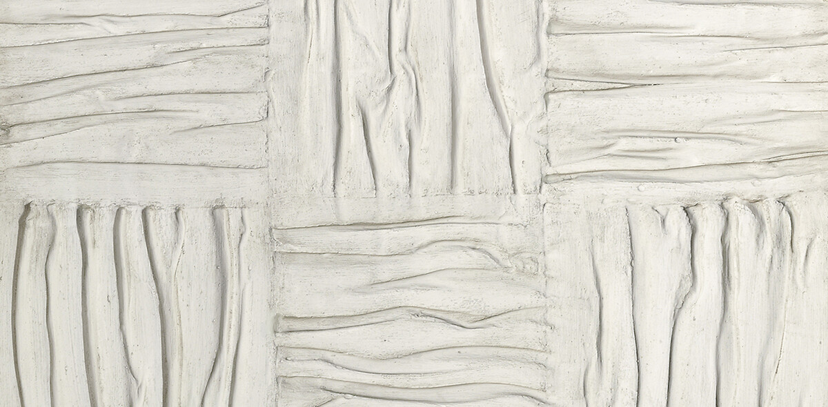
Robert Ryman: ‘Ledger’ (1982)
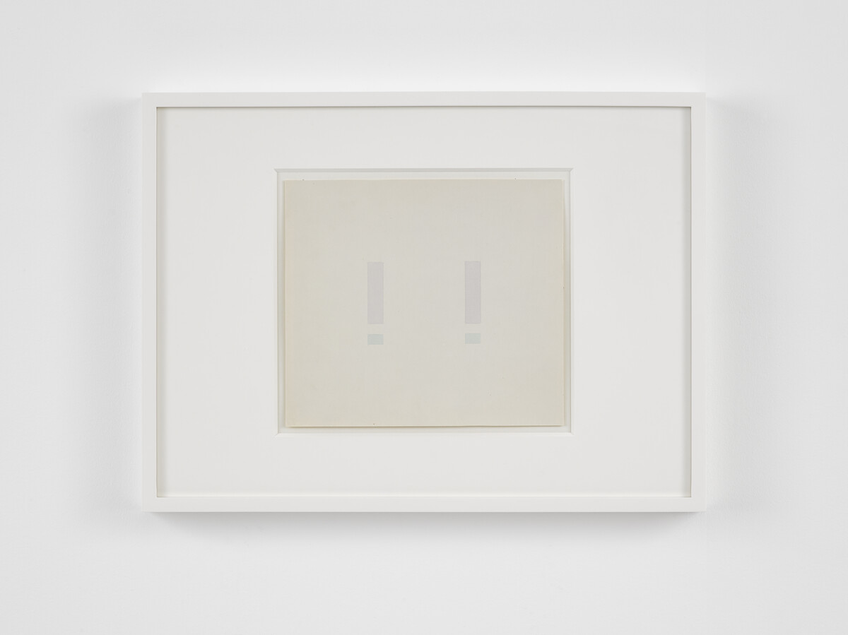
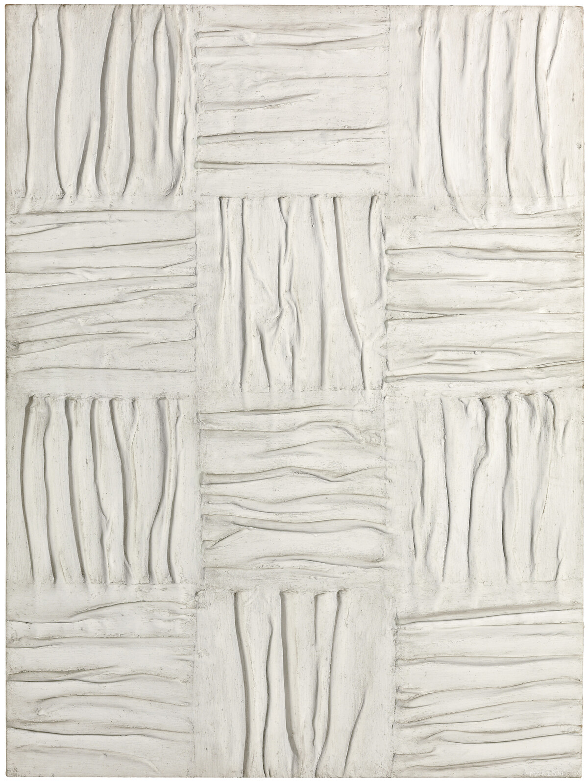
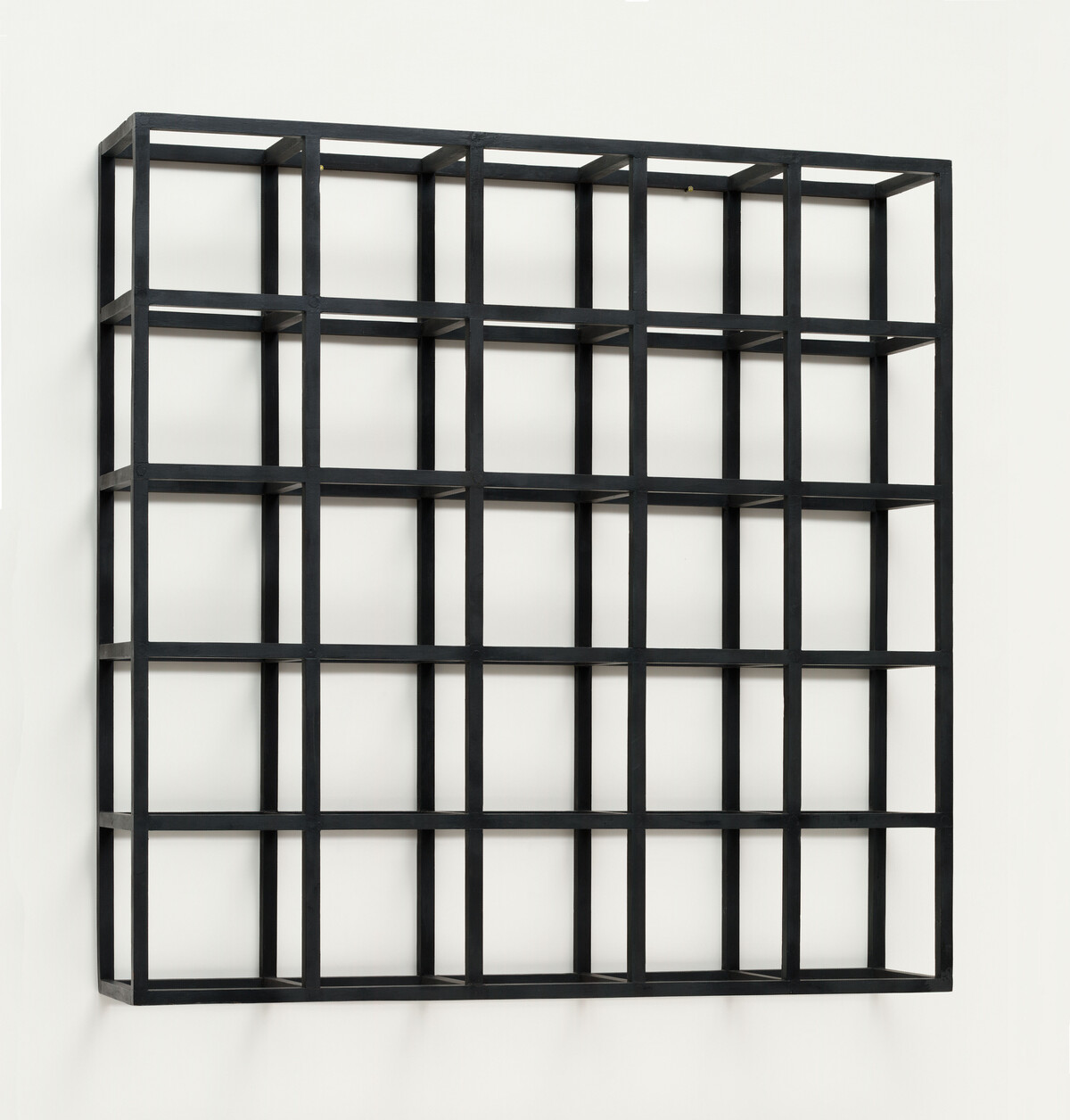
Like Manzoni’s Achromes, Ryman’s painting Ledger FIG. 13 privileges physicality. However, rather than eradicating gesture and expression, Ryman left carefully considered traces of his artistic process on the surface of his works to emphasise the properties of his materials. Ryman, born in Nashville, was first introduced to the American art scene in June 1953 when he began work as a guard at the Museum of Modern Art, New York (MoMA).63 During the seven years he spent there he became familiar with the work of the Minimalists Dan Flavin (1933–96) and Sol LeWitt (1928–2007).64 LeWitt’s works may have influenced the object-like appearance of some of Ryman’s paintings, which results from his integration of supports onto the canvas. LeWitt’s painted-wood piece Cubic-Modular Wall Structure, Black FIG. 14 may have been instructive in formulating the idea that paintings could be executed on a variety of supports and in various shapes. Ryman began painting the same year he started working at MoMA, during a period when Minimalists and colour field painters were prominent, and the death of painting was being declared.65 However, Ryman was committed to creating paintings featuring a ‘spatially open surface with vivid intimations of the process remaining in the air’ to express the continuing validity of painting.66

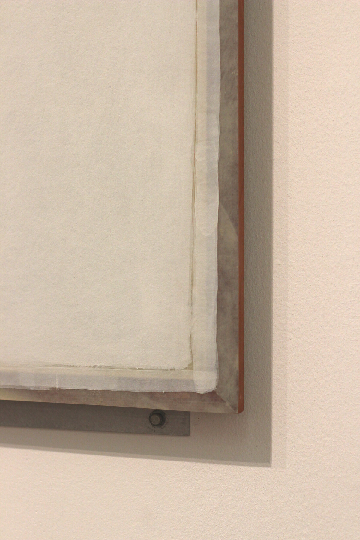
Ledger is indicative of this practice. It comprises Enamelac paint, described by Ryman as ‘essentially painted shellac’, which produces a non-porous surface, on fibreglass, aluminium and wood.67 Although the primary function of the aluminium strips are for wall mounting, they also function as part of the painting and were treated as such by Ryman, who textured the material with a wire brush so that ‘the metal absorbs light evenly’.68 This close attention to the detail of each component as an object perhaps reflects what Robert Storr calls Ryman’s ‘empirical approach’ to painting, again accentuating the materiality of the work.69 The wood used for Ledger also serves a functional purpose, as it provides a surface on to which the aluminium strips can be fixed. However, Ryman chose it for its ‘reddish hue’ FIG. 15, indicating that, like the strips, its inclusion was carefully considered and should be interpreted as part of the work, rather than simply a framing device.70 Vittorio Colaizzi describes these elements as the ‘physical frontiers’ of Ryman’s paintings, going on to argue that they ‘act as avenues of extension into the room’, again emphasising physicality.71
Ryman’s decision to use white is comparable to Manzoni’s desire for the viewer’s attention to be free ‘to appreciate the various physical surfaces’.72 However, Ryman took a very different approach to the application of his surface material. Colaizzi asserts that Ryman’s time spent studying and playing jazz influenced the gestures he used when painting, citing Ryman’s jazz teacher Lennie Tristano as being well known for his ‘systematic breakdown of the elements of jazz’ – a quality that was clearly passed along to his student.73 It is reflected in Ryman’s method, in which he ‘theorises painting by rehearsing its elements’.74 Throughout his career Ryman developed an acute understanding, through experimentation and rehearsal, of paint texture and the way it changed according to the support used; Ledger is no exception. Ryman’s carefully considered, methodical use of materials based on their handling properties echoes the emphasis put on ‘the process qualities of painting’ by early Russian avant-garde artists and later also by the Constructivists.75 This concern for materiality, linked to a ‘commitment to systematic investigation’, was an important component of faktura.76 When painting Ledger Ryman used three sizes of hogshair brush and applied the paint in sweeping motions, the traces of which are just visible. Although these traces are very faint, they are intended to represent paint as a substance, confronting the viewer with questions about the ‘how’ of the painting.77
One element of Ledger that particularly elicits the question of ‘how’ is the square band of overlapping paint strokes that appears to mimic strips of tape. The answer lies in the tools that Ryman used (the width of the band corresponds to the width of the brush), but it is also in his choice of paint. Ryman’s use of Enamelac was intended to partially reveal the ground of the fibreglass in order to ‘soften the incoming sun from skylight’ and reduce surface reflection, much like Li and Manzoni.78 Enamcelac’s ‘translucent, milky surface’ allows for this visual effect, evoking Ryman’s idea of the painter as chemist, selecting which materials to use based on careful consideration of their properties.79 Even the absence of glass on top of Ledger is a considered element of the work. As Colaizzi argues, ‘Ryman’s ideal mode of vision is one permeated by bodily and tactile awareness, and a glass or plastic window disrupts this free flow of space’.80 As the author Monika Gehlawat argues, when confronted with a painting by Ryman ‘one is forced to be proactive and engage with the sheer materiality of the work in terms of brush stroke of paint or canvas’.81 It is arguably through his careful selection and application of materials that Ryman allows the viewer to indulge in the physicality of the painting and find meaning in the monochrome.
Conclusion
The white monochrome paintings discussed in this article exemplify the way that technical art history can help demystify such works as well as providing an insight into the artists’ intentions, which in turn can be instructive in terms of historical analysis. Considering these paintings in relation to one another demonstrates the value in refocusing our attention to a material-based analysis when ‘subject matter and even symbolic meaning are withheld’, evidencing the ways in which technical analyses can draw out the interpretative qualities of monochrome works.82 Expanding this approach to other forms of abstract art could generate new ideas about artistic experimentation and the ways in which we interpret the results.