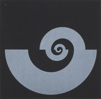
Fig. 2
Cover of Spirale 5, edited by Marcel Wyss and Eugen Gomringer. 1955. (Courtesy Lars Müller Publishers, Zürich).
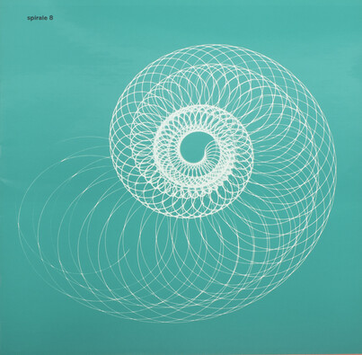
Fig. 3
Cover of Spirale 8, edited by Marcel Wyss and Eugen Gomringer. 1960. (Courtesy Lars Müller Publishers, Zürich).
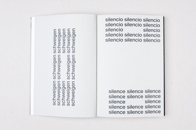
Fig. 4Silencio, by Eugen Gomringer. 1954. From Words Form Language: On Concrete Poetry, Typography, and the Work of Eugen Gomringer, edited by Simon Mager. 2022. (Courtesy Triest Verlag, Zürich).
Fig. 5
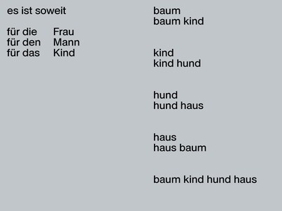
Right: Baum kind hund haus, by Eugen Gomringer. 1952. From Words Form Language: On Concrete Poetry, Typography, and the Work of Eugen Gomringer, edited by Simon Mager. 2022. (Courtesy Triest Verlag, Zürich).
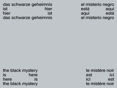
Fig. 6The black mystery is here, by Eugen Gomringer. 1953. From Words Form Language: On Concrete Poetry, Typography, and the Work of Eugen Gomringer, edited by Simon Mager. 2022. (Courtesy Triest Verlag, Zürich).
Fig. 7
From Words Form Language: On Concrete Poetry, Typography, and the Work of Eugen Gomringer, edited by Simon Mager. 2022. (Courtesy Triest Verlag, Zürich).
Fig. 8
From Words Form Language: On Concrete Poetry, Typography, and the Work of Eugen Gomringer, edited by Simon Mager. 2022. (Courtesy Triest Verlag, Zürich).
Fig. 9
From Words Form Language: On Concrete Poetry, Typography, and the Work of Eugen Gomringer, edited by Simon Mager. 2022. (Courtesy Triest Verlag, Zürich).
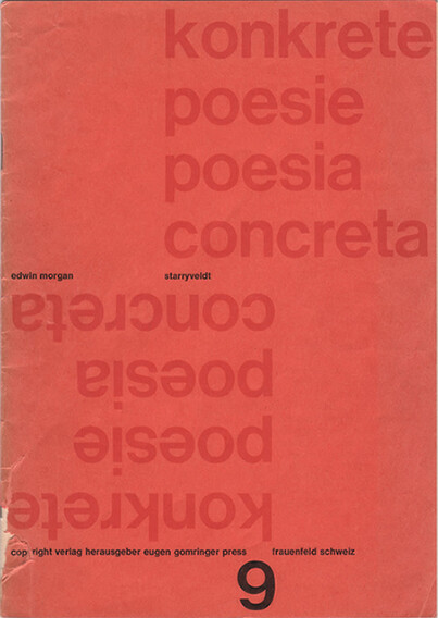
In his biography of the Scottish poet Edwin Morgan (1920–2010), James McGonigal describes the hesitance of Morgan’s publisher, Carcanet, to engage with Morgan’s experiments in concrete poetry in the 1960s and 1970s. Carcanet’s editor, Michael Schmidt, was ‘notably unenthusiastic about concrete poetry’, McGonigal states, considering the style to be ‘a branch of graphics or calligraphy’.1 His comments reflect an anglophone critical consensus that still holds sway in some quarters, one that classes concrete poetry as a cheap neo-avant-garde gimmick in its elevation of the visual aspect of writing: not really poetry at all, but mere play with typography.
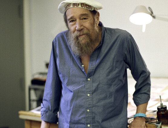
The Bolivian-born Swiss poet Eugen Gomringer (b.1925) published Morgan’s first full collection of concrete poetry, Starryveldt, in 1965 as part of his multilingual pamphlet series konkrete poesie/poesia concretaFIG.1. In an interview with the present author in 2021, a ninety-six-year-old Gomringer had limited memories of this collaboration, although he did name the Scottish poet Ian Hamilton Finlay (1925–2006) and the Guernsey-born monk and typewriter artist Dom Sylvester Houédard (1924–92) as ‘interesting and important’ British figures in the concrete movement.2 Nonetheless, the publication of Starryveldt was a significant endorsement of Morgan’s practice, and by 1965, although only in his thirties, Gomringer had acquired near-mythical status among acolytes of the international concrete movement that he helped to establish during the previous decade.
Indeed, it is Gomringer, more than any other proponent of the discipline, whose work represents the integration of poetry and graphic design that irked certain literary figures. In his 2021 book Words Form Language: On Concrete Poetry, Typography, and the Work of Eugen Gomringer, the graphic designer Simon Mager mounts an effective defence of the connection:
With the discovery of poetic space – the white surface – automatically comes an awareness of blackness, the positive shapes that form and structure the surface and create its rhythm. At a macro level, what is important is the placement of the text, the words, leading, tracking and spacing, contrast, and hierarchy. At a micro level, the choice of basic material creates the word object itself: the typeface and the letter shape with its countless formal and historic variations. Serif and sans serif, script and handwriting, typewriter (monospaced) uppercase or lowercase, and so forth.3
The concrete poets simply surfaced this buried layer of meaning that is found in all written language: ‘when the word became an image, the letterform became the fundamental drawing tool and the brush in the hands of the concrete poet. The form, weight, and scale of each letter could, at best, become part of what was intended to be said’.4
Although a preoccupation with typography would understandably nudge the poet towards visual communication, the resulting connection to visual art is more complex. Surely, one could argue, the graphic medium broached here has more to do with commercial design than anything else? The retort to this critique during the 1950s and 1960s reflected the philosophy of mid-century Modernism. Gomringer, like other northern European concrete poets, came of age in the era of Concrete art, a movement that stood not only for the reduction of creative expression to a limited palette of forms, but also for the unbinding of distinctions between high art and functional design. The latter included typography: the Concrete artists Richard Paul Lohse (1902–88) and Max Bill (1908–94) also produced commercial work, including posters that ‘aimed to concentrate colour, form, and typography to communicate in the most direct and effective way’.5 If poetry was partly a matter of graphics, there was no reason why it too could not legitimately be considered visual art.
Gomringer arguably has done more than anyone else to bear out this notion. Raised in Bolivia speaking Spanish – which perhaps partly explains a lifelong interest in multilingual communication – Gomringer relocated to Switzerland in the 1940s, where he studied artistic and literary history at the University of Bern. By the end of the decade his literary interests included the symbolist poet Arno Holz (1863–1929), as well as North American forerunners of concrete poetry’s visual sonic grammars, such as Gertrude Stein (1874–1946) and William Carlos Williams (1883–1963). However, Gomringer had also become closely acquainted with the major figures of Swiss Concrete art, including Camille Graeser (1892–1980), Lohse and, most significantly, Bill, a former Bauhaus student, whose 1940s work and theory shaped the conceptual framework of Concrete art to a large extent. It was Bill who, seizing the unrealised potential of Theo van Doesburg’s manifesto ‘Basis of Concrete Painting’ (1930), elaborated the idea of works of art that would express scientific and mathematical formulas in intuitive and tangible forms, having no basis in a reality external to the painting and manifesting as little as possible of the artist’s emotional investment or indication of ‘subject-matter’.
In 1953, with the artists Dieter Roth (1930–98) and Marcel Wyss (b.1930), Gomringer founded the magazine Spirale FIG.2FIG.3, which provided the forum for his first concrete poems.6 Works form this period, such as SilencioFIG.4, Baum kind hund hausFIG.5 and The black mysteryis hereFIG.6, established a tone of ascetic revery that would define Gomringer’s visual-linguistic practice for decades to come. Tiny groups of letterforms and words evoke elementary relationships between colours, senses, concepts, objects and people, while activating a visual sense through minimalistic spatial arrangements. From early on, his works were set out in the Neue Haas Grotesk typeface, which is now known as Helvetica, and with an ‘almost spiritual rigour’, utilising a ‘reduced set’ of typographical elements.7
In their use of a tiny number of compositional motifs and their iconic appearance, these pieces are indebted to Concrete art, a point that Gomringer was happy – indeed determined – to emphasise:
There was no concrete poetry without Concrete art. The art came first, and the name ‘concrete’ came from that [...] the first exhibition of Concrete art was in 1944 in Basel. That featured Constructive art from all around Europe.8 There were also groups in Switzerland, including in Bern, another scene in Basel, and another in Zurich [...] what we discovered as young people was that what these artists could do with single surfaces and forms and so on, was a foundation: we could do the same things with poetry, with language.9
Connections to the world of Concrete art were strengthened when, in 1954, Gomringer became Bill’s ‘secretary’ at the Hochschule für Gestaltung, Ulm, a design school cofounded by Bill the previous year as a successor to the Bauhaus. He recalls such duties as ‘speaking with famous people when they arrived from America: taking them from their flights’.10 Walter Gropius and Josef Albers, the latter of whom struck up a lasting friendship with the young poet, were among the Bauhaus luminaries invited back to Germany to speak at Ulm, many of whom had emigrated to the United States on Hitler’s rise to power.
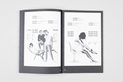
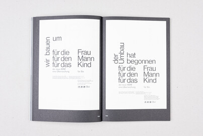
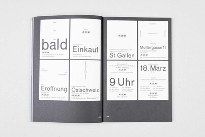
A significant, more creative, element of Gomringer’s work at Ulm, as Mager notes, was his delivery of a course entitled Sprache als Gestaltungsmittel (Language as a Means of Design). ‘Gomringer taught the students how to use language in a precise, objective manner through descriptions of designed objects [... they] completed exercises in writing advertising texts for products, captions for images and were encouraged to reflect on language and words and their function within sentence structure’.11 This extract hints at the relationship between Gomringer’s poetry and the kind of functional descriptive language he was teaching his students to utilise. In his own career Gomringer ploughed a similar furrow, while also employing a visual aesthetic rooted in Concrete art. In 1959 he was appointed Propagandachef (Head of Communications) at sia Abrasives, Switzerland, which produced such materials as sandpaper. The same year he began creating a visual and linguistic identity for the Swiss department store Au Bon Marché (ABM), in collaboration with the graphics studio E+U Hiestand FIG.7FIG.8. Later, in 1967, Gomringer took on a role as Cultural Director for the porcelain manufacturer Rosenthal, which sustained him for twenty years, and included successful collaborations with such artists as Gropius and Andy Warhol.
Mager notes with a hint of regret that Gomringer ‘went on to use his theory and literary and poetic achievements far more often in advertising and copywriting than in actual poetry’.12 However, the most engaging section of Mager’s text focuses on Gomringer’s work with E+U Hiestand and ABM, showing how Gomringer’s linguistic and visual aesthetics as a poet fed into and benefited from his paid assignments:
To explain ABM’s thinking, Gomringer mainly used repetition and permutation, two linguistic forms that he had previously explored in his constellations [...] The text design directly influenced its typographic arrangement on the page. As in Gomringer’s constellations, the text was not merely placed linearly but composed as typographic clusters on the page. The core messages were strongly emphasised and worked as a typographic image shaped by the pure letterforms of the typefaces of the time: Akzidenz Grotesk and Helvetica regular.13
Gomringer’s work for ABM, including a series of constellatory text-clusters advertising a new store in St Gallen FIG.9, are clearly works of commercial design. But from the post-constructivist perspective that produced them, they utilise communicative and symbolic devices identical to those of the concrete painter or poet.
At the same time, to deny any difference between Gomringer’s creative and paid practice would be wrong. In this regard, one of his most important concrete poems is one of his earliest. Silencio comprises the title word arranged fourteen times – emulating the lines of a sonnet – around a blank central space. This void both expresses the theme with wordless intensity and appears to inflect the letterforms around it, making them stand more intimately for ‘silence’. Written the year after John Cage’s 4’33” – although Gomringer does not note any connection to Cage’s work, calling him simply ‘a man of the same time [...] dealing with the same problems, the same expressions, the same themes’14 – this poem has also been convincingly interpreted as a work of mourning for the dead of the Second World War.15
For the poet himself, meaning is more ineffable than any contextual reading of Silencio would suggest. But, for the same reason, neither is it comparable to the graceful but hollow form of the advertiser’s epithet. As Gomringer noted, ‘I felt at that time that it was a beginning. Silence is the beginning: the beginning of meditation and so on. And you always have to come back to silence’.16 Poet, artist, or designer, it is Gomringer’s evocation of mystery, of the play and feint of language, and of the deep domains of meaning beyond words, that ensures the value of his craft.
is a writer based in Glasgow. He is the author of Border Blurs: Concrete Poetry in England and Scotland (2019).
Footnotes
J. McGonigal: Beyond the Last Dragon: A Biography of Edwin Morgan, Dingwall 2010, p.239. It is fair to note that Carcanet has published a wide range of innovative and experimental poetries across its lifespan, as well as more traditional forms.footnote 1
Interview between Eugen Gomringer and the present author, 21st August 2021. Assistance with translation was kindly provided by Gomringer’s daughter, the poet Nora Gomringer (b.1980).footnote 2
S. Mager: Words Form Language: On Concrete Poetry, Typography, and the Work of Eugen Gomringer, Zurich 2021, p.175.footnote 3
Nine issues of Spirale were published between 1953 and 1964. The magazines were not digitised but some originals are still available from Lars Müller Publishers, Zürich.footnote 6
Mager notes that this show featured ‘Abstract art from Bauhaus-related artists, De Stijl, Abstraction-Création, and the young Swiss scene emerging around Max Bill and Richard Paul Lohse’, Mager, op. cit. (note 3), p.69.footnote 8